An interactive R Shiny dashboard that turns Singapore's public procurement data into explorable insights on ministry spending, agency–supplier relationships, and what the government actually buys.
Singapore’s government posts more than S$10 billion in procurement opportunities on GeBIZ every year, open to ~30,000 registered suppliers. The raw data is public — but there was no way for the public or ministries themselves to see how that spending breaks down. GeViz is an interactive dashboard built to close that gap.
My role: Develop R Shiny visualisations and web app. Built with Sheryl Chong and Nguyen Dang Thanh Ha as part of IS428 Visual Analytics at SMU.
The gap in the raw data
Three things were missing or messy in the open GeBIZ dataset before we could visualise anything:
- No ministry field. Only agency and supplier. We scraped the Singapore Government Directory to map each agency to its parent ministry.
- No procurement category. Without it, no “what does the government actually spend on?” view was possible.
- Inconsistent agency names. Some embedded the ministry, some didn’t — a naming cleanup.
Classifying procurements from tender descriptions
To backfill procurement category, I trained a multi-class text classifier on the subset of tenders that did have categories, then applied it to the rest.
Pipeline: tf-idf on tender descriptions → benchmark four classifiers in scikit-learn.
| Model | Accuracy |
|---|---|
| Linear SVM | 0.899 |
| Logistic Regression | 0.687 |
| Multinomial Naive Bayes | 0.592 |
| Random Forest | 0.273 |
Linear SVM won. With a high-dimensional tf-idf feature space, a linear kernel was enough — non-linear mapping wouldn’t have helped and would have cost training time.
We didn’t resample the imbalanced classes. The majority categories (e.g. Services) are exactly the ones decision-makers care about most, so prediction bias toward them was acceptable here.
The dashboard
Four linked views, each answering a different question:
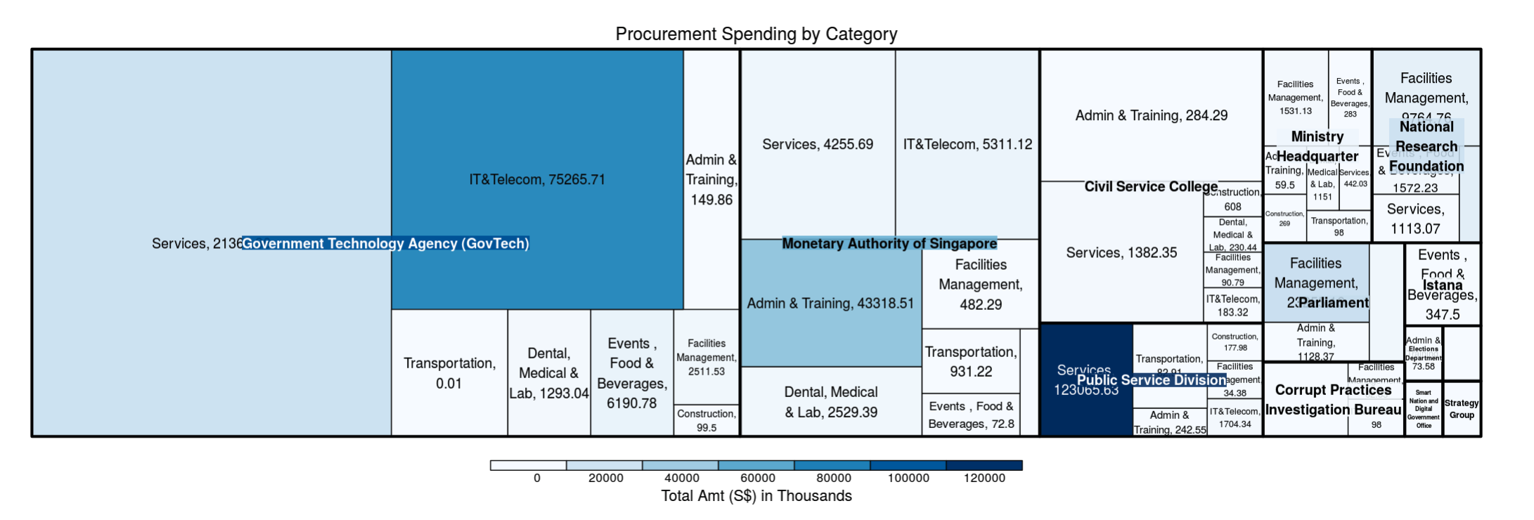
- Treemap — an overview of ministry spending by agency and category. Box size = number of contracts, colour intensity = total dollar amount.
- Network diagram (visNetwork) — agency–supplier relationships under a selected ministry. Surfaces shared suppliers across agencies.
- Sankey diagram (networkD3) — cash flow between a selected agency and its suppliers for a chosen category. Path thickness = dollar amount.
- Word cloud + description table (wordcloud2) — top keywords across tender descriptions, with a searchable, sortable table to drill into individual awards.
Filters (year, ministry, agency, category, awarded-amount range) thread through every view so the user can move from overview → relationship → cash flow → specific tender without losing context.
What it surfaces
Running the PMO through the dashboard for 2017: Public Service Division had the largest single spend (~S$123M on Services), but GovTech ran the most contracts. Drilling into GovTech’s IT & Telecom category, NCS and Accenture dominated supply — and NCS recurred as a top supplier across MAS, PSD and GovTech, matching its real-world role as the government’s primary ICT provider.
Stack
R Shiny · dplyr · ggplot2 · treemap · visNetwork · networkD3 · wordcloud2 · Python (scikit-learn) for the classifier · deployed on shinyapps.io.